this is everything else
Brand Identity and Squarespace Update
I first met Sarah Grace Dougherty (SGD) a little over two years ago when she became active in our NYC Delta Gamma Alumnae group and eventually took over my position as vp: communications. Although she’s a PR professional by day, on the side she’s a writer and blogger building out her website This is Everything Else. The blog had been put on the back burner for a bit as her 9-5 career took off, but due to the COVID-19 pandemic SGD has been home with her parents and has the time to begin focusing on her online presence again. So because I am an extremely extra gift-giver, I offered to give her blog a full facelift just in time for her 25th birthday! Starting with the logo and branching out to giving to her Squarespace-hosted site a makeover, the new brand needed to fully express who SGD is and what she writes about: being a young woman in the middle of a constantly changing world.
about the client
Started as a side outlet to write and share post-grad experiences, travel, and settling into life in New York City, This Is Everything Else is a lifestyle blog in its early stages of development. Its writer, Sarah Grace Dougherty, shares observations and tips, with the ultimate goal being to make growing pains, financial growth, and other ‘less polished’ topics more normal, and to stay in touch with long-distance friends.
project goals
➵ Develop branding that makes the blog feel genuine to its author
➵ Provide a launching point for Sarah to expand her site from just a personal blog to a more professional corner of the internet
➵ Help one of my closest friends start 25 off right!
getting started
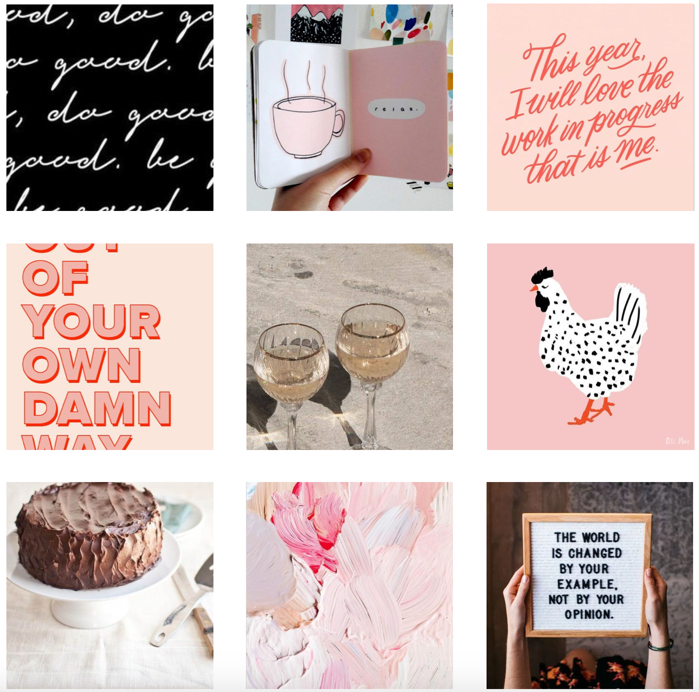
After providing three different mood board options exploring different sides of her, we honed in on one that felt the most true to Sarah now—not who she was or who she wants to be. This set the tone for a slightly vintage-inspired but bold palette and style that leans heavily into pinks and reds accented with a honey gold.
brand adjectives
vivacious • bubbly • warm • supportive • bright
logo and additional assets
The final primary logo uses strong lettering with a slightly retro flair. Set in all caps to make a bold statement about who Sarah is and representing her strong voice, it also utilizes some quirky glyphs to keep the logo feeling fun and fresh. To prevent it from veering too into the girly category, it is primarily in the pinkish red we’ve named “cherry bomb” but the drop shadow in “peppy” helps it retain some of its femininity.
website updates
from the client
“CASEY. I cannot express how much I love this or how accurately ' me' it is! The watermarks, colors, stock photos. And the author portrait... I mean... come ON. This is truly such a gift and it is so reinvigorating to see my little spot on the internet grow and embrace a 'real' brand. Truly!!”


