personal brand
Brand Identity & Website Update
After being laid off from my media role in April 2020 due to the COVID-19 pandemic I had to figure out what the heck to do with my time. Since it’s a little hard to keep running paid social when you have to pay for your own budgets, I decided to rediscover the inner art kid I had abandoned to go into media. I picked up a couple of new clients for both brand design and illustration, and when I looked at my website it didn’t quite work for how I wanted to present myself and all of my new projects. My domain was initially purchased and set up in the summer of 2015, and it was easy to see that it was no longer representative of who I am. All of the projects were from my undergrad career at least 5 years ago (potentially more) and didn’t encompass the kind of design that I wanted to move forward with. So—it was time to start over and do something new to re-announce who I am on the internet.
about the client
You can read more about me on my about me page, but here’s a condensed version: I graduated from WashU in St. Louis with a BFA in Communication Design and a second major in Art History before switching to the dark side to work in digital media. I’ve always considered myself a “left-brained creative” and need to ensure any way I present myself online marries both of my passions and career directions.
project goals
➵ Design a logo that encompasses all aspects of my personal and professional brand
➵ Apply that logo and style to my website to feel fresh and better organizes and showcases my work
getting started
Figuring out the mood I wanted to express and what colors I wanted to use to represent myself was tough. I needed to be able to project myself as a designer while also maintaining my more “professional” media side. Was I bright and fun? Was I muted? I went through about five different directions before I settled on the final version. Beyond focusing on my favorite color “dusty rose” (people always laugh at the specificity there), it mainly focuses on neutrals with a few accents to shift it into feminine territory.
brand adjectives
feminine • empowered • classic • kind
final logo and marks
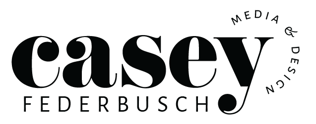
My final logo hits both sides of me: the sans serif (with one of my all-time favorite ampersands) brings modernity and speaks to my media side, while the classic serif with a twist comes from my designer side. I love how the bold ball terminals play against the thin lines of my name, and the “media & design” mimics that circle around the edge of the logo. Although I played with a number of color options and stylistic choices at the end of the day the simple black text best represents me and encompasses both aspects of my professional personality.


